Updated on: 30 October 2026
An architectural moodboard fixes how a project should look and feel before drawings, 3D models or renders begin: images, material samples, colors and light references on one board that the whole team works from.
This guide covers what goes on an architectural moodboard, how to make one in nine steps, the 9 common types with examples, a checklist before you render, and how to carry the board into a render, in a 3D workflow or in ArchiVinci.

A color and material moodboard for a café: sage-green slats, rattan, light oak and white tile. An AI-generated illustration, not a built project.
What Is an Architectural Moodboard?
An architectural moodboard is a visual collection of images, materials, colors, and textures used to define the style and atmosphere of an architectural project. It helps architects and designers organize references in one place and communicate design intent clearly at an early stage.
A moodboard is not a final design. It lets the team compare and discuss directions before detailed drawings, 3D modeling or visualization start, and it stays the reference point afterwards, so materials, colors and the character of the space remain consistent as the project develops.
6 Key Roles of an Architectural Moodboard
Defines the design intent: it shows from day one what the project is trying to express, its atmosphere and character, so later decisions can be checked against the original concept.
Keeps the visuals consistent: materials, colors, textures and light sit on one board, so every decision relates to the same idea and the project feels coherent rather than fragmented.
Guides modeling and rendering: visualization artists read from it how materials should feel, how light should behave and which mood the images must carry, instead of guessing.
Supports design decisions: different directions can be compared early, before anyone commits to detailed work, which cuts revisions later.
Gives the team a shared language: architects, interior designers, clients and visualization teams react to the same pictures, so feedback is clearer.
Makes renders more believable: a render convinces when space, material and light come together, and a board with well-defined references gives the render that target.
What Does an Architectural Moodboard Include?
Most architectural moodboards combine material samples, a color palette, texture references, inspiration images and light references; stronger boards add keywords, scale cues and site context. Each element tells the people who model and render the project something specific:
Material samples: wood, concrete, stone, metal or fabrics are usually the starting point. They are not product selections but references for the character, weight and feel of the materials, and they show whether a space should feel heavy or light, rough or refined. A board that holds only these, often as physical samples, is called a material board or sample board.
Color palettes: a palette locks in the overall mood early and sets limits that keep the design from drifting. Once it is clear, decisions about finishes and lighting become more straightforward.
Texture references: textures show how surfaces should read up close and across the room, which matters in visualization, where surface quality plays a large role in realism.
Inspiration images: buildings, interiors, landscapes or precedent projects. They are not there to be copied but to communicate spatial feeling, proportion and atmosphere quickly.
Lighting and ambiance: references for how natural and artificial light should shape the space through the day. They guide both design decisions and render setups.
Patterns and shapes: they explain the underlying logic of the design and keep form, rhythm and visual language consistent.
Keywords: a small set of strong words keeps the project focused; when a decision gets unclear, they bring the discussion back to the original intent.
Scale and proportion references: images with people in the space, ceiling heights or a sense of openness show how the architecture should feel in use.
Context: site photos, surrounding buildings, climate and cultural context keep the project grounded in its real environment.
Material combinations and transitions: showing how materials meet helps avoid awkward junctions later, in the details and in the renders.
Atmospheric effects: shadows, reflections, transparency, greenery or water shape the mood and soften the space.
User experience cues: images of movement and everyday use shift the focus from static pictures to lived space.
How to Make an Architectural Moodboard
A good board comes from a few decisions made in order. These nine steps work for a student project, a house or a hotel lobby:
Write the brief and three keywords. Note the project, the client and the feeling you are after, then pick three words (for example "calm, tactile, bright") that every image has to support.
Collect precedents and site photos. Gather buildings, interiors and landscapes that share that feeling, plus photos of the site and its surroundings, so the board stays tied to the real place.
Choose one lead material. Pick the material that defines the project, such as oak, brick, travertine or concrete, and let the others support it.
Fix the palette with codes. Add color swatches with their paint or color-system codes, so the colors can be reproduced later.
Add a light reference. Show the light you want: soft daylight, low warm sun or dusk with the lights on.
Add a scale reference. At least one image with people, a doorway or a known ceiling height shows how big the space should feel.
Edit it down. Remove every image that does not change the message; a few strong images read better than a crowded wall.
Annotate. Label the materials, finishes and where they go, and write the keywords on the board.
Share one version. Export a PDF or share an online board, so the client, consultants and visualization team look at the same thing.
The nine types below follow the same process; each puts the weight on a different part of the board.
9 Types of Architectural Moodboards
1. Concept Moodboard
A concept moodboard, or concept board, is made at the very start of a project. It sets the emotional and atmospheric direction before any concrete decision, with artistic references, abstract textures, nature images, photography and a few keywords rather than specific materials.
Its job is to give designers and clients one shared story for the project and to set the tone for later decisions. It is best used for first presentations, brainstorming and setting the creative direction.
2. Material Moodboard
A material moodboard, also called a material board or sample board, shows the physical qualities of the project and how its materials work together. It holds real samples of wood, stone, metal or fabric, or good photos of them when samples are not at hand, with finish variations and color swatches to compare options. For the materials themselves, see our guide to building materials.
It communicates material intent and helps judge compatibility, feasibility and budget. It is best used for interior design, façade studies and finish schedules.
3. Color Moodboard
A color moodboard defines the color strategy and tonal balance: palettes or tonal families, plus light and shadow references that show how the colors behave in the space. A calm interior often starts from neutral interior color palettes.
It keeps color consistent across materials and rooms and, in some projects, supports branding. It is best used for interior palettes, brand-driven spaces and hospitality projects.
4. Visual Style Moodboard
A visual style moodboard defines the architectural language of the project: references to architectural styles such as minimalist, brutalist, Scandinavian, industrial or contemporary, together with precedents that show proportions, massing and design language.
It aligns the team on one style and clarifies expectations early. It is best used for concept presentations and competitive bids, and in early schematic design.
5. Spatial Moodboard
A spatial moodboard is about scale, flow and spatial atmosphere: images of spatial experiences, light direction and the relationship between inside and outside, which describe how the space should be perceived.
It supports user experience, massing and layout decisions at early stages. It is best used for interior architecture, public buildings and conceptual space planning.
6. Lighting Moodboard
A lighting moodboard shows how natural and artificial light should shape the spaces: sunlight studies, shadow patterns, diffused lighting references and examples of artificial light, often with fixture ideas and color temperature ranges.
It communicates lighting intent and guides the later interior lighting design and fixture selection. It is best used for interiors, museums, hospitality and retail projects.
7. Digital Moodboard
A digital moodboard is built in an online whiteboard, a moodboard app or layout software. As of October 2026, Miro offers mood board templates, Milanote has an architecture moodboard template for images, plans, materials and texture samples, and Morpholio Board is a mood board app for iPad, iPhone and Mac.
It is flexible, easy to update and easy to share, which suits early design development and remote work, and it is best used for professional presentations, school submissions and remote client work. If you are looking for an AI moodboard generator: ArchiVinci does not assemble boards; it comes in once the board is done, as described in From Moodboard to Render in ArchiVinci.
8. Physical Moodboard
A physical moodboard uses real material samples, printed images and sketches, usually pinned up in the studio, so people can touch and compare the materials.
It supports material evaluation and final design validation. It is best used for high-end residential projects, hospitality design and client presentations; if you are hiring a designer to put one together, see what designers charge for a mood board.
9. Hybrid Moodboard
A hybrid moodboard combines both approaches: digital boards for the concept and iteration, physical boards for the material decisions, so it bridges concept development and execution.
It is best used for large architecture firms and multidisciplinary design teams.
Architectural Moodboard Examples
The three boards below show three of the types above. Like the café board at the top of this guide, they are AI-generated illustrations, not photos of built projects or ArchiVinci results; what matters is how each one is put together.
Concept Board in Yellow and Green

A concept moodboard: one strong color, natural textures and plants set the mood before any material is chosen.
This board fixes a feeling, playful and bright against deep green, without choosing a single product. The repeated yellow and the plants act as keywords, and the swatches turn them into a palette the design can use.
Material Board for a Warm Living Room

A material board: warm oak leads, with tan leather, green tile and woven textures as accents.
The lead material is easy to read: oak appears as herringbone, slats and furniture in most tiles. The green tile and the leather chair are the accents, and the pictures of whole rooms show the light and scale the materials are meant for.
Neutral Mediterranean Interior Board

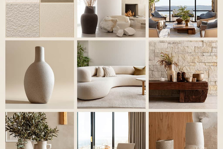
A visual style board in nine tiles: cream plaster, stone and raw wood in a calm Mediterranean palette.
Nine tiles in one tonal family: plaster swatches, rounded furniture, stone and raw wood. With almost no color contrast, the textures do the work, which is why a board like this needs at least one picture of a whole room, here the arched window, to show light and scale.
Interior vs Exterior Moodboards
Interior and exterior boards ask for different references, because the render has to answer different questions:
| Interior moodboard | Exterior moodboard |
|---|---|---|
Focus | Material feel, furniture, color temperature | Massing, proportion, facade rhythm |
Light | Artificial light and daylight through windows | Sun, sky and shadows on the facade |
Scale | People, furniture, ceiling height | People, trees, cars, neighboring buildings |
Context | Views out and the rooms around it | Site, street, landscape and climate |
What decides realism | Texture, reflection and soft light up close | Material color, joints and shadows from a distance |
For an interior, small changes in texture, reflection or light softness change the result a lot; for an exterior, the sky, shadows and surroundings count more than fine material detail.
Moodboard Quality Checklist (Before You Render)
Before you model or render, check that the board does its job. A clear board reduces interpretation errors later and leads to more consistent, realistic results:
Is the overall mood clear at first glance? The board should communicate one dominant atmosphere without explanation. If the mood feels mixed, the render will likely reflect that confusion.
Are material qualities readable? Materials should clearly suggest surface behavior such as roughness, softness, reflectivity or weight. Avoid references where finishes are ambiguous or heavily filtered.
Is the color palette consistent? Colors should relate to one another and support one tonal direction. Check that accent colors are intentional and do not compete with the dominant tones.
Does the board suggest lighting conditions? There should be a clear sense of light quality: daylight or artificial light, soft or contrasted, bright or dim. Unclear lighting often leads to flat renders.
Is scale implied? References should hint at proportion, ceiling height, openness or intimacy. Even abstract boards benefit from one image that suggests human scale.
Are styles aligned or deliberately contrasted? Mixing styles works only when the contrast is intended. If styles clash by accident, set a hierarchy or simplify the board.
Is there a clear priority? One material, mood or spatial idea should lead; the other references reinforce it instead of competing with it.
Is the board concise? Fewer strong images beat many weak ones. If removing an image does not change the message, it does not belong.
If most of these points can be answered confidently, the moodboard is ready to move into rendering. If not, refining the board first will save time and improve the quality of the final visuals.
How to Turn an Architectural Moodboard Into Realistic Renders?
In a 3D workflow, turning a moodboard into realistic renders means carrying one idea through modeling, materials and lighting. The board defines the intent; the render is only as good as the care with which that intent is translated, step by step. Our separate guide collects tips for realistic results that apply to any engine.
Read the Board as Information
Look at the board critically and read it as information rather than inspiration: how rough or reflective the surfaces are, where the light comes from, how soft and how warm it is, how the colors relate and what the space should feel like. Writing these points down keeps the translation consistent and avoids subjective decisions later.
Model the Massing First
The references guide proportion, scale and overall form, not an exact copy. SketchUp is often used for quick massing, Rhino 3D for complex geometry, and Blender or Autodesk 3ds Max for detailed modeling and visualization. Keep the model simple at first and let the detail grow only as needed.
Set Materials From the Board
Each surface should carry the qualities the board suggests instead of a default material. Start with base materials that match the color and texture, then refine roughness, gloss and surface depth step by step, checking each change against the board.
Light the Scene to the Board's Mood
Lighting is where the mood comes together: even a board without technical lighting shows a clear atmosphere, and reproducing natural and artificial light faithfully is what makes a render photorealistic. Offline engines such as V-Ray and Corona give fine control over exposure, color temperature and shadow softness; as of October 2026, Corona works in 3ds Max and Cinema 4D, while V-Ray also runs in Revit, SketchUp, Rhino and Blender. Check every lighting decision against the board.
Choose the Engine and Finish in Post
Real-time tools such as Enscape, Lumion and Twinmotion suit fast iteration during design development; offline renderers are preferred for final images where accuracy matters most. Post-processing is the final touch, not a repair: color balance, contrast, exposure and a little atmospheric depth. When the earlier steps are solid, it stays minimal.
From Moodboard to Render in ArchiVinci
ArchiVinci does not read a moodboard picture: no module takes a board as a style reference or blends several boards. You bring the board's decisions in through a picture of the space, a short description and the lighting buttons, and through the Edit module one material or one object at a time. Each run generates a new image in seconds, online in your browser, so you can render your design with AI and hold the result next to the board. There are five ways in.
1. Put the Board Into Words
Upload the space, a sketch, a view from your 3D model or a photo (JPG, PNG or WebP up to 5 MB), to the Interior or the Exterior module. Type the board's three or four main decisions, the lead material, the palette and the light, in a short description: it is optional, and the app warns above 200 characters. Then pick the lighting button that matches the board (in Interior: Daylight, Warm light, Twilight, Golden hour, Ambient or Studio light) and, where the board shows them, Add object tags such as Plants or Lamps. For rooms, the AI interior design page shows more examples.

Left: the uploaded drawing. Right: the result of the prompt "Warm modern living room with an oak floor, a beige linen sofa, a low travertine coffee table and sheer curtains." with the Daylight button, on the default engine.
The default engine, ArchiVinci 4.0, keeps the perspective and geometry of your upload, so the board's materials and light land on your own design; every run draws a new variation, so run it again for another option or refine a detail in the Edit module.
2. Bring One Material In
To test one swatch from the board on one surface, open the Edit module (ArchiGPT), mark the floor, wall or counter, and use Apply texture with a material from the library or a photo of your own sample. The AI paints the material into a new image; it does not wrap a texture file onto a model the way texture mapping does in a 3D program.

Made in the Edit module: the shower wall was marked with Select, then Apply texture with a tile from the library and the prompt "apply this tile to the shower wall".
3. Bring One Product In
For a chair, a lamp or a vase from the board, put its picture under "Upload object (optional)" in the Edit module, mark where it goes and say it in the prompt, which Edit always needs: for example "place this armchair by the window". The model works the object into the marked spot, and the rest of the image stays as it is. The picture is sent as an object, not as a style reference; the page on how to place an object in a render shows the steps.
4. Start From a Plan
If the space exists only as a plan, draw it or upload it in Floor Plan Maker, which runs in desktop browsers. Give floors, walls and ceilings the board's finishes, such as wood, tile, stone, concrete, paint colors or fabrics, and see them live in 2D and 3D or in a first-person walkthrough. Then render the current view with a lighting choice and an optional prompt, at the normal render credits. Drawing, 3D and the walkthrough are free; reading an uploaded plan with AI costs 1 credit on a free account and is refunded if the conversion fails.
5. No Space Yet: Picture the Concept
At the concept stage, when there is nothing to upload, the Imagine module (Dream Space AI) turns a written description into a picture you can pin on the board. Write the description in English.
How to Describe a Moodboard to an AI
The description carries the board, so keep it short and concrete:
Describe the board in one or two sentences: one goal, then the lead material, the palette and the light, in plain words: "Warm modern living room, oak floor, linen sofa, travertine coffee table, soft daylight."
Name each material and where it goes: "travertine floor, honed", "walnut wall panels, vertical grain", "matte black metal on the fixtures". Add scale where it matters, such as "large-format tiles".
Say what to leave out: "no chrome", "no stone on the walls". A short exclusion can help when a material keeps drifting.
Match the light to the palette: warm woods under cold light look wrong. Pick the lighting button first, then add only what it does not cover, such as "pendant over the table".
Change one thing per run: every run is a new image from your upload, so compare runs that differ in one point only: the light, then a material, then an object.
Our guide to architecture prompts has more examples. On a free account each run uses one credit, and a new account starts with 3 free credits; with a plan, renders on the default engine are unlimited and one run can return up to four images. Plans are on the pricing page, and using renders for clients, marketing or sale needs an active plan.
Describe your moodboard, get a render Upload a sketch, a 3D model view or a photo, describe materials and light in a sentence, and ArchiVinci renders it as a photorealistic image in your browser. A new account starts with 3 free credits. |
Common Moodboard-to-Render Mistakes
Overloaded boards: too many styles on one board blur the direction, for the people who model it and for an AI model alike. Keep a tight set.
Vague descriptions: "make it nice" says nothing. Name one goal, the key materials and the light.
Changing too much between rounds: change one thing at a time, or you cannot tell which change helped.
Light that fights the palette: warm woods under cold light look off; match the light to the colors.
Weak uploads: a blurry or heavily filtered picture of the space hides the details the render should follow. Upload a sharp JPG, PNG or WebP of up to 5 MB.
Expecting a copy: a render follows the board's mood, materials and atmosphere; it does not reproduce its pictures one to one.
Key Takeaways
An architectural moodboard is a decision-making tool, not only inspiration: it turns early ideas into a visual logic that guides the whole project.
A good board has one lead material, a clear palette, a light reference and a scale reference, and nothing that does not change its message.
The 9 types (concept, material, color, visual style, spatial, lighting, digital, physical, hybrid) each serve a different moment of the design.
Read the board as information before you render: material behavior, light, color relationships and spatial mood.
Realistic renders come from controlled interpretation, not copying: geometry, materials and light respond to the board's intent.
In ArchiVinci, the board goes in through words, one material or one object at a time, or a plan with its finishes, and every run generates a new image from your upload.
Try it in ArchiVinci
Upload a sketch, a photo or a 3D model view and describe the result in a sentence: ArchiVinci generates a new image that follows your upload. A new account starts with 3 free credits.
From a photo or an image: Render an image with AI
For a render you already have: Render enhancer AI
Frequently Asked Questions
How many images should an architectural moodboard have?
There is no fixed number. A single-page board usually works with somewhere between a handful and about a dozen images, and a material board may hold fewer, larger samples. Use the test from the checklist: if removing an image does not change the message, remove it.
What is the difference between a moodboard and a material board?
A moodboard sets the overall look and feel: atmosphere, style, light and color, often with pictures of whole spaces. A material board, or sample board, is narrower: it shows the actual finishes, often as physical samples with their codes, so they can be compared and specified.
Can ArchiVinci turn a moodboard picture into a render?
No. ArchiVinci does not read a moodboard as a style reference and cannot combine several boards. Upload the space instead (a sketch, a 3D view or a photo), describe the board's main decisions in a sentence and pick the matching lighting button; to test one material or add one product from the board, use the Edit module, as shown in the five paths above.
Can I add a product from my board to a render?
Yes, one at a time. In the Edit module, put the product picture under "Upload object (optional)", mark where it goes and say it in the prompt, for example "place this armchair by the window". The model works the object into the marked spot, and the rest of the image stays as it is.
Will the render match my moodboard exactly?
No. The output is not a one-to-one copy: expect alignment in mood, materials and atmosphere, not exact replication. Every run generates a new image from your upload, and runs do not build on each other; to change one part of a result, use Edit render on it, mark the area and describe the change.
Which files can I upload to ArchiVinci?
Pictures of the space as JPG, PNG or WebP, up to 5 MB: a sketch, a screenshot or export of a view from any 3D, CAD or BIM program, or a photo. ArchiVinci does not open model files such as .skp, .rvt or .3dm.
Can I use the renders in a client presentation?
Yes, with an active plan: commercial use, which includes client work and marketing, needs one. Many architects present the renders as they come, and with a plan you can run a view again as often as needed when a result drifts from the board.